
The DAI Environmental Design Special Interest Group is a group of people living with dementia, care partners, practitioners and researchers (architecture, design, health) from across the world. Members have recently experienced the advantages of working together globally. We have been exchanging emails across the globe that are focused on the topics of colour and pattern in dementia design.
Despite a lot of research, there's limited knowledge about how colours and patterns affect people living with dementia. This poses challenges for architects and designers for how to make environments that support people.
Why is colour important for people living with dementia?
Our buildings are full of colour. You will find it in paint, wallpaper, furniture, flooring, and curtains. These colours can make a place homely and easy to use or they can make it bland, too busy, or confusing.
Choosing colour and pattern carefully can make a real difference to how a place feels and functions. A well-designed environment can support people with dementia to enjoy greater independence.
For example, colour can be used to help with finding your way around a building, or for helping you to see your food on your plate.
The main tool that architects and designers use is ‘contrast.’ Or how much things stand out from each other or the background. High contrast can be used to make things more obvious – like seeing a doorknob on a door. Low contrast can be used to make things less obvious, like the transition between carpet and vinyl flooring to help with smooth walking. Contrast is described more later in the blog.
But if we are deciding how to use colours in designing a shared place – what should we be using?
What does the research say?
O’Connor (2020)1 says that use of color is one of many design factors that can influence and enhance people living with dementia’s experience of the environment. It can work with strategies to support engagement (being able to do and be involved), and support orientation (feeling like you know where you are, what time it is) and wayfinding (being able to get from place to place).
There are 2 useful reports you can read if you are interested: "Colour in Healthcare Environments – A Research Report" 2 and "Colour Design Schemes for Long-term Healthcare Environments."3 Both raise concerns about how we have thought about colour. They think there are issues with the quality of the work done in this space and oversimplifying the findings . They suggest a shared theory about how colour affects mood and feelings may not be useful. This is very personal, depends a lot on context and has not been supported by good research.
Dalke has done some experiments and makes recommendations for architects and designers.
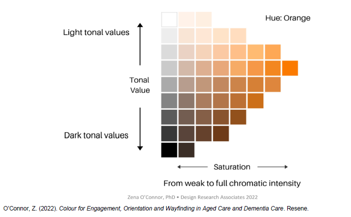
To understand how to use colour, it's helpful to know the terms that are used.
There are 3 main terms used:
"Hue" (the actual colour eg. red, green, orange)
"Tone" (how much grey or black is in the colour - affecting brightness or contrast),
"Saturation" (or how intense a colour is)
These are shown in the diagram below by O'Connor.
 The most important thing to know about colour is that tone or contrast helps people with dementia to understand their environment.
The larger the gap in tone between objects, the easier it is to tell them apart. This can be used to advantage for example by having a toilet seat that is much darker or lighter than the floor covering. The contrast makes it easy to locate.
However, it is better for different areas of floor or rugs to have similar tones to each other to help people move around with confidence. For instance, black doormats can look like dark holes on a light floor.
One way of checking the contrast materials is to take a black and white photograph and check if the materials are the same tone or ‘greyness’.
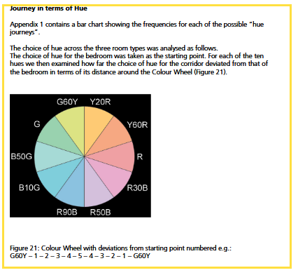
Dalke’s report also suggested thinking about colour as a journey between rooms or spaces.
In my role as an aged-care architect, this idea of thinking about colour between rooms, such as a bedroom, corridor, and lounge, is particularly impactful. Thinking about a person and how they move around in the space is helpful and person centred.
Based on this approach, they recommend :
Keeping colours in nearby spaces within the same colour family on the colour wheel. For example yellow, orange, red
Keeping low brightness (tone) throughout the nearby spaces.
Keep saturation or intensity of colour low in adjacent spaces, but you might want to use moderately intense colours for bedrooms or lounges.
Don’t use intense colours (high saturation) in corridors.
The diagram below by Dalke describes journeys in terms of hue.
 Here are some of Dalke's key conclusions:
It's important to understand that 75% of people in the 75+ age group will have serious vision problems.
For residents who can’t move around easily, it is essential to be able to change their environment, scenery, or provide access to outdoor spaces for interest and stimulation.
Creating a room with a different colour from the rest of the place can encourage people to visit that space, for example, having a blue room in an otherwise mostly pink building.
Provide wider corridors that allow two people to walk together. Combining this with an accent wall colour, can make using the corridor easier.
Extreme colour contrast that is not well-coordinated can be unpleasant in smaller rooms. Using a slightly darker version of the same colour for contrast is preferable.
Age can change how we perceive colour. The yellowing of lenses affects colour vision. This can make colours like lilac appear dull and gray, while blues and greens may appear more interesting.
Green has been used too much in mental healthcare environments.
Strong colours can lead to afterimages (continuing to “see” the colour in your vision), so it's important to choose colours that work well together in spaces next to each other.
Generally, paler colours are preferred.
Using colour can help people living with dementia to recognise places and support their independence.
DAI members pointed out that colour and preferences for it are very personal and affected by life history. So it is important to work with people about colours in their space.
How can this information help people living with dementia and their carers?
You can use contrast in tone or darkness easily at home. It can be helpful to paint the door to the toilet in a distinct colour that is much darker or lighter than the wall. If there is more than one toilet you could paint both the doors the same colour so that the colour becomes associated with the toilet. Then you wouldn’t use that colour anywhere else.
If you are choosing wallpaper, pick one that has an artistic design rather than a realistic one. It’s helpful if there is a simple pattern that is not highly geometric. For example if the wallpaper is striped the stripes need to be the same tone. You might want to choose a pastel colour with a familiar, simple design and make sure that the walls contrast with the floor.
To find the middle of curtains when they are closed you can add a strip of contrasting colour on the ‘leading edge.’ This will make it more obvious where the curtain edge is.
A building can be made more interesting by painting a destination room, like a sunroom or a lounge in a different colour to the other rooms. Adding art and objects that are part of a theme can make this feel like you are somewhere different from the rest of the rooms. An example of this might be a seaside theme. Choose something that is meaningful to the occupant. This can provide stimulation and help with wayfinding.
I hope this helps you understand the research and how to make use of it. I'm still looking for more information about patterns, and I'll let you know in another blog when I find it. The links to the full articles are below.
What colours and patterns do you prefer in your spaces? Are there any you dislike? Any that make you feel overloaded, irritated or just not at ease?
What are the colours in your favourite space?
If you are interested in talking about how environments can affect people living with dementia, please consider joining the ED-SiG: /get-involved/special-interest-groups/ed-sig
REFERENCES
1.O’Connor, Z. (2020). Color Design and Dementia: Harnessing HCI to Improve Environmental Visual Literacy. In R. Brankaert & G. Kenning (Eds.), HCI and Design in the Context of Dementia (pp. 223–235). Springer International Publishing. /10.1007/978-3-030-32835-1_14
2.Tofle, R. B., Schwarz, B., Yoon, S.-Y., Max-Royale, A., & Des, M. E. (2004). Color In Healthcare Environments—A Research Report.
3. Dalke, H., & Matheson, M. (2007). Colour Design Schemes for Long-term Healthcare Environments (London). Kingston University.
About the Author
Sara McCunnie is a Senior Architect with over 11 years of specialisation in aged-care design, working in both New Zealand and Australia. Her primary passion lies in designing environments for individuals living with dementia. She is particularly focused on how aged-care typologies can evolve to uphold human rights in the face of demographic challenges.
In her architectural practice, Sara actively engages in applying empirical design research in real-world contexts, often utilising clinical data to evaluate the effectiveness of design interventions.
As a member of the Dementia Alliance International's Environmental Design Special Interest Group, she is committed to advocating for design that respects the dignity, autonomy, independence, and equal opportunities of those living with dementia.